
agi@hiskot.com
Skót © 2022
Focus on Emotions studies belonging, connection, and emotional development in children. Their website was not reflecting any of that. This is the story of how a redesign changed that — and what it took to get there.
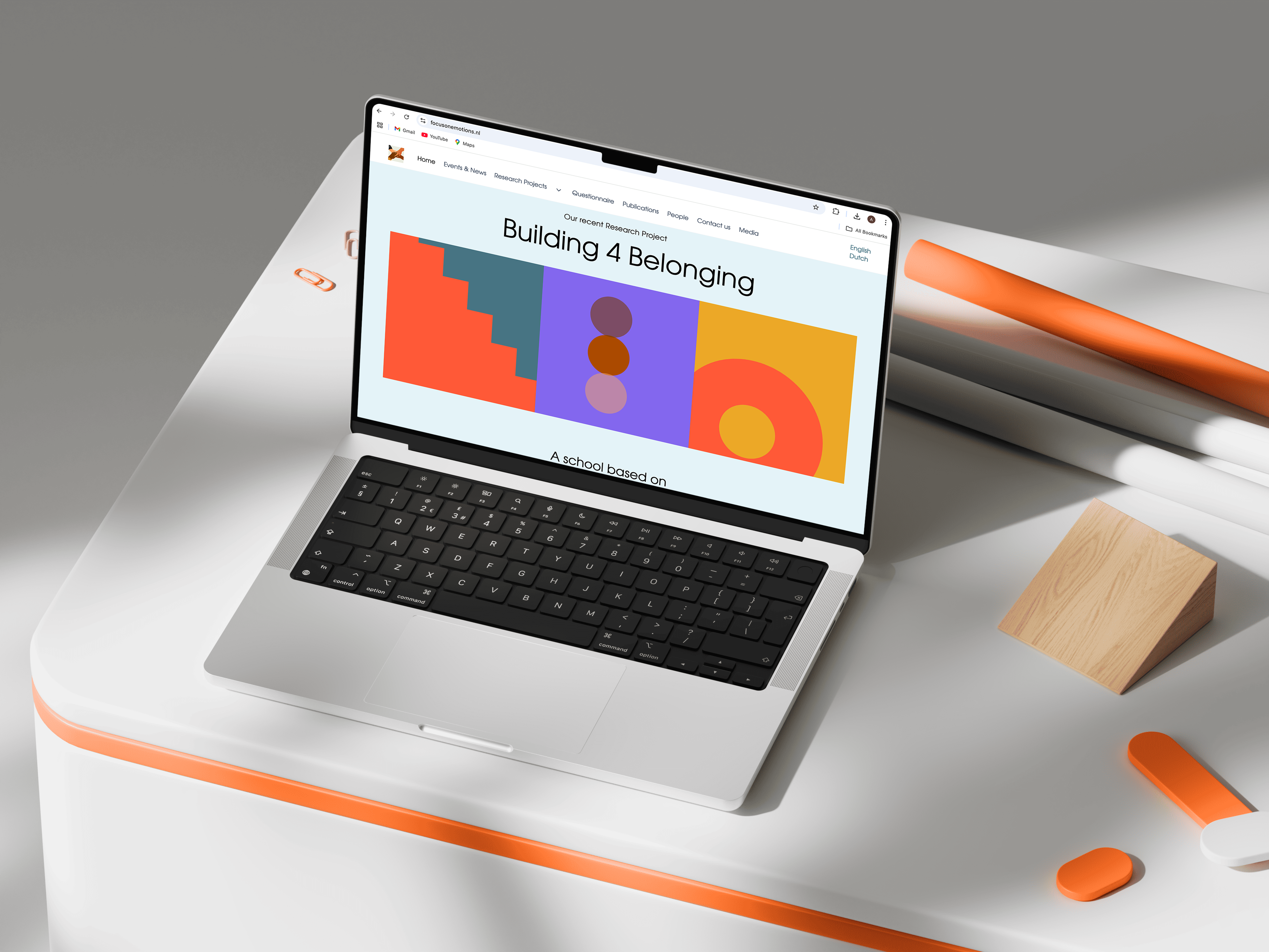
Focus on Emotions is a research group focused on emotional well-being in youth, the social environments around them, and the role of new technological developments. I redesigned the website to improve navigation, clarify structure, and give the group a more distinct and memorable digital presence.
Making important research feel as human as the work it represents.
This project was about more than improving usability. It was about closing a gap between what the research group stood for and how they appeared online.
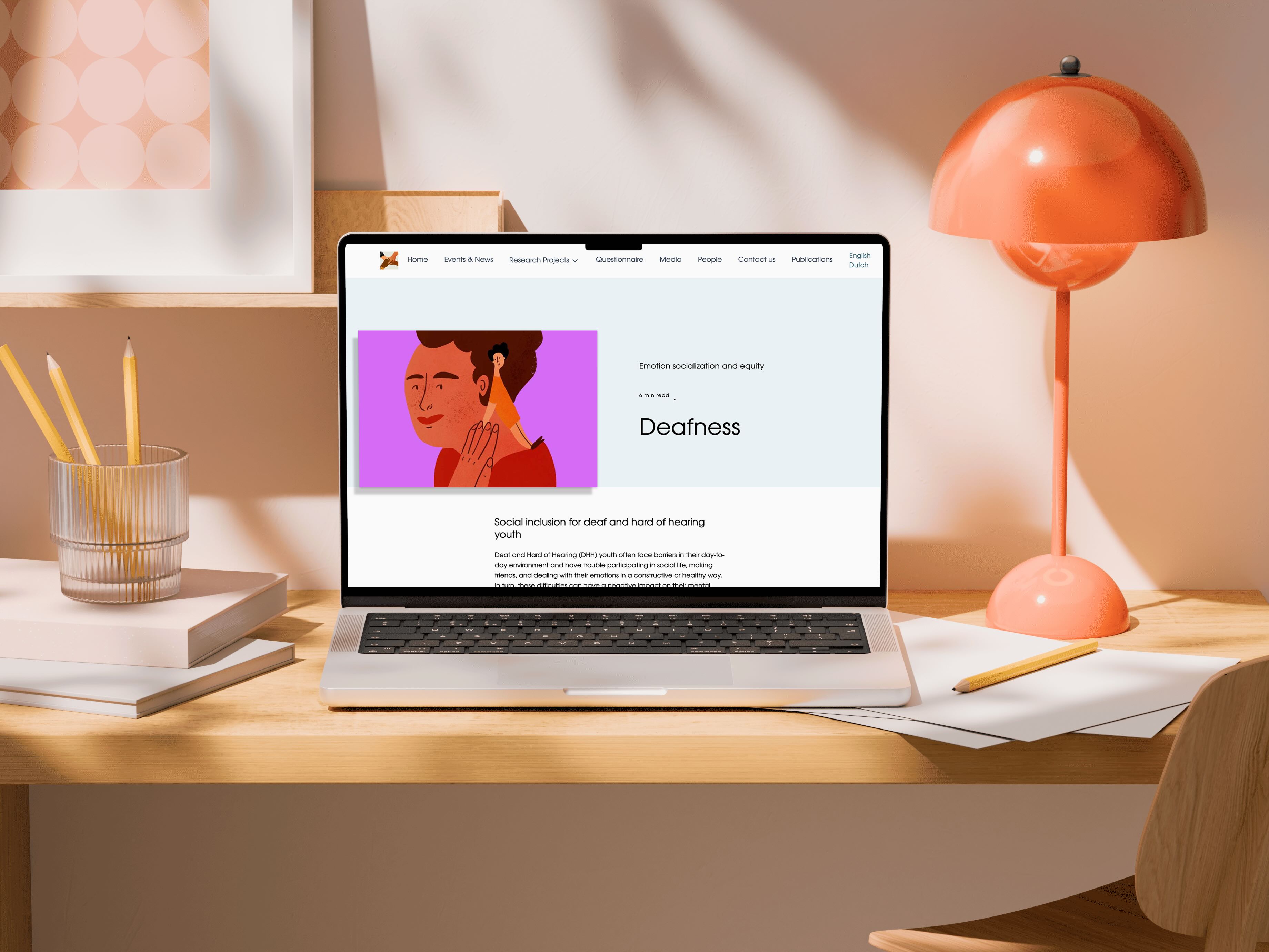
The work itself was deeply human. It focused on children, emotions, belonging, autism, deafness, language development, and social inclusion. But the old website felt distant, generic, and hard to connect with. It presented valuable research, yet gave visitors very little reason to stay, trust, or remember what they had found.
The redesign became a way to bring the emotional truth of the work back into the experience of the website itself.
Focus on Emotions is led by Prof. Carolien Rieffe and is connected to Leiden University, the University of Twente, and University College London.
The website served very different audiences at once: researchers, funding bodies, intern begeleiders and ondersteuningscoördinatoren in Dutch schools, media professionals, and parents looking for something useful in often already demanding situations.
The content was there. The research was strong.
But the experience was not helping the group reach those audiences as clearly as it could, and it was not leaving a strong impression after people left.
The group had a clear ambition: they wanted to be visible, recognizable, and remembered.
A website that felt like a filing cabinet was not going to do that.
I worked closely with the principal investigator and the broader research group throughout the project. There were no formal handoff moments. Decisions were discussed in real conversations, tested live in Webflow, and refined through direct feedback.
Responsibilities
• UX research and user interviews
• Card sorting sessions with the research group
• Information architecture
• Visual direction and interaction design
• Designing, building, and iterating directly in Webflow

The old website was built on a Joomla template and extended over time. The structure was not the result of a deliberate user-centered design decision. It was a default that had stayed in place for years.
That shaped the whole experience.
There were eight top-level navigation items, each expanding into long submenus. On mobile, visitors were met with an exhausting vertical list before they could reach any content. The People page showed grey camera placeholders instead of real faces. Publications appeared as dense bullet lists. Instruments were buried in a long sidebar.
The site communicated one thing very clearly: it was built for the team, not for the visitor.
That created the central contradiction of the project. A research group called Focus on Emotions was presenting itself in a way that left little emotional trace.
The redesign had to support three very different groups:
• Researchers looking for structured knowledge
• Educators and parents looking for practical suppor
• Media professionals looking for a credible source they would remember
At the time, the group was also preparing funding applications for the Building4Belonging project. The website needed to support that ambition.
The goal was not only to improve usability. It was to create a website that helped the group be seen and remembered.
To understand how Focus on Emotions could stand apart, I reviewed comparable Dutch research and education platforms.
The aim was not to prove that these sites were poor. Many were credible, thorough, and professionally made. But they often shared the same pattern: strong information, conventional structure, and very little distinct identity.
The old Focus on Emotions website already fit that pattern.
nji.nl felt authoritative and comprehensive, but largely functional: a place to find information and leave.
Radboud University psychology pages felt dense and academic, clearly built for researchers already comfortable inside that structure.
Leiden University psychology pages were clean and professional, but strongly tied to institutional hierarchy rather than quick public understanding.
The pattern was not poor quality.
The pattern was sameness.
That mattered because Focus on Emotions did not only need a clearer website. The group wanted a more distinct and memorable digital presence.
The question was not only how to make the website clearer. It was how to make it feel recognizably theirs.
My assumption was that the website was underperforming not because the research was weak, but because the structure, navigation, and visual identity did not reflect what the group stood for.
If the site became clearer, more navigable, and more recognizably its own, it could better support non-academic visitors, improve visibility for media professionals, and create a stronger first impression for academic and funding audiences.
What the research later confirmed was simple:
The problem was never what the site said.
It was how it felt to use.
Through behavioral observation and direct conversation, I looked at what it actually feels like to arrive at this website under real conditions: time pressure, distraction, urgency, and different levels of familiarity with academic content.
Three key user groups made the problem visible from different angles.

Azar works at a mainstream Dutch primary school and supports children with special needs, including autistic children and children with developmental language disorders. She often needs research-backed information she can bring into conversations with parents, teachers, and support teams.
She is not visiting out of curiosity. She is visiting because she needs something useful.

It is late afternoon. Her young child is next to her asking for attention. She opens the site because she has a parent conversation the next day and wants to quickly find material that could help. She lands on a page full of text. There is no clear focal point. No obvious path. She starts scanning, loses track, scrolls, tries again, and closes the tab.
Not because she does not care.
Because she does.
And because she does not have the time to fight the interface to get to what matters.
That scene stayed with me. It made the problem feel very concrete. This was not a visitor leisurely browsing an academic archive. This was someone trying to do a good job under pressure.
The design implication was clear: the site needed stronger hierarchy, faster orientation, and a calmer path into the content.
Mark is a media worker and blogger working across deadlines, articles, and fast-moving requests. He often researches on his phone, on the train, and in short gaps between other tasks.
If a site feels slow, outdated, or hard to navigate, he leaves.
But he also notices when a site feels distinct. Those are the ones he remembers.
He is on a crowded train with two hours before deadline. He is looking for an expert voice on autism and social inclusion in schools. He lands on the website, opens a long dropdown, tries to orient himself, and then moves on to another source.
Speed gets Mark in the door.
Distinctiveness is what makes him come back.
That meant the redesign had to do more than organize content well. It had to create recognition.
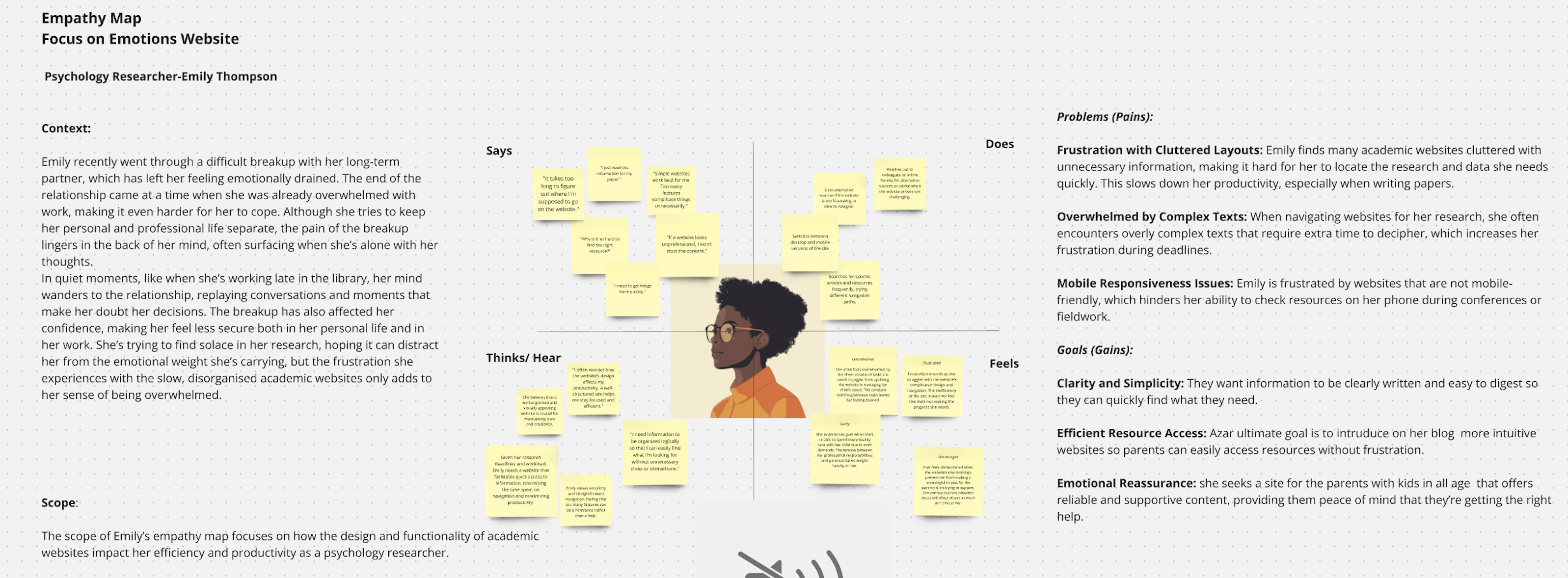
Emily is a psychology researcher who regularly uses academic websites to compare publications, instruments, and methodologies. She knows what she is looking for and expects the structure of a site to reflect the rigor of the research behind it.

She is not afraid of complexity.
She is frustrated by unnecessary friction.
She has multiple tabs open while comparing measures and papers. She visits the site looking for a specific questionnaire and finds herself working through long lists, weak hierarchy, and a structure that demands more effort than it should.
The content is there, but the path to it is heavier than necessary.
That insight mattered because it showed that clarity is not only for non-experts. Even expert users lose time when information architecture is weak.
Every major design decision was tested against the same questions:
Is it clear enough for Azar?
Is it fast enough for Mark?
Is it structured enough for Emily?
If the answer to any of those was no, the decision needed more work.
.jpg)
The affinity map brought everything together. Across different users and contexts, the same themes kept returning.
• The site was hard to use on smaller screens
• It lacked a clear visual identity
• Long text blocks made pages feel heavy and hard to scan
• Navigation demanded too much effort before people reached content
• Strong material was buried under weak hierarchy
• The tone and presentation felt more institutional than welcoming
Together, these findings pointed to one central issue:
The site was organized for the team, not for the visitor.
That was the turning point. Once that became clear, the redesign was no longer about making pages look better. It was about changing the logic of the experience.
From the beginning, there was tension around the direction of the redesign.
The research team leaned toward a more traditional, text-led academic website. That made sense. They cared about the seriousness of the work and did not want visual decisions to weaken credibility.
But I saw a different risk.
Without stronger visual structure, the content would continue to disappear into itself. Visitors would still have to work too hard to understand where to begin. The site would remain correct, but forgettable.
I kept thinking about children’s books.
The images do not replace the story. They help the reader follow it. They create rhythm, support understanding, and make the experience easier to remember.
That became an important principle for this project.
The visual layer was not there to decorate the research. It was there to help the research land.
Trust did not appear all at once. I had to explain my thinking, show examples, test directions, and gradually make the value visible through the work itself. Over time, the research group leader gave me more freedom to push the design further.
That changed the project.
Not because I had won an argument.
Because the work itself had made something newly visible.
This was not a staged Figma-to-handoff project.
The design evolved directly in Webflow: built, reviewed, changed, and built again. The research group had access to the live site throughout the process. They were not reacting to static mockups. They were reacting to real pages, real content, and real interaction patterns.
That changed the nature of the collaboration.
Feedback became more grounded. Decisions became faster. The conversation shifted away from abstract preference and toward what the site was actually doing.
It was messier than a perfectly staged design process, but also more direct.
The discipline was not in controlling every step. It was in holding onto the direction while the form kept evolving.
I designed and built the site myself in Webflow. There was no developer handoff and no long gap between design intent and implementation.
I started from three different templates. Each offered something useful, but none held the full solution. I stripped them back, resolved the contradictions between them, and rebuilt them into one coherent system.
Every responsive breakpoint, interaction, hover state, and layout issue was tested and adjusted directly by me.
Because the design and the build lived in the same hands, the project could move with more immediacy. What the team saw was not a promise of a future site. It was the site taking shape in real time.
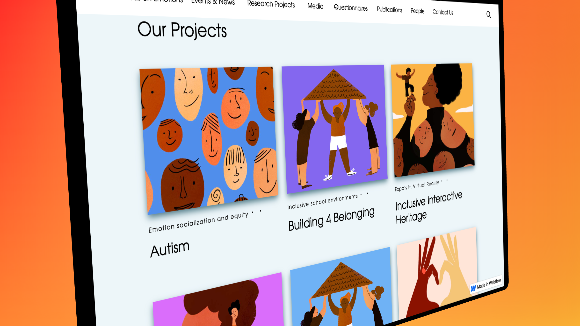
The card sorting session was one of the most important moments in the project.
Until then, no one had really asked how the team themselves mentally grouped their work. When they started sorting projects freely, they did not organize them by publication type, internal department, or institutional hierarchy. They grouped them by theme: autism, belonging, deafness, play.
That revealed something important.
The old structure was not only hard for visitors. It did not even reflect how the researchers themselves thought about their own work.
That discovery changed the information architecture, but it also changed the conversation. The team was no longer reacting to a designer’s outside opinion. They had seen the mismatch themselves.
That changes everything.
Cards became the structural answer because they supported both clarity and memory. Lists present information. Cards create entry points. They invite people in.
The card-based structure was not only about clarity. It was also about memory. By giving each research project its own visual card, the content became easier to scan, easier to distinguish, and easier to remember.
So the card structure was not only a navigation decision. It was also a recognition system.
For a group that wanted to be remembered, that mattered.
That distinction shaped the visual direction.
I was not trying to give the website a fashionable layer. I was trying to give it a recognizeable presence: something that could hold seriousness and warmth at the same time.
There is a reason stories stay with us in a way that information does not. That was the thread running through every visual decision.
One line from this project still captures the heart of it for me:
Empathy is not a method. It is the moment you stop designing for a user and start designing for a person.
That was the standard.
Every visual decision passed through the same question: does this feel like the research it represents?
Not: does this look modern enough.
Not: does this look academic enough.
But: does this feel true to the work.
I wanted the site to feel distinctive enough that someone in media or academia who had seen it once would recognize it again later.
My first direction was more restrained: black and white, quiet, minimal, almost doodle-like.
The intention was good. I wanted to respect the seriousness of the research and avoid anything that felt superficial.
But when I tested it, something was missing.
It was still too cold.
It still kept people at a distance.
It looked cleaner than the old site, but it did not feel more alive. It did not carry the warmth, openness, or human presence the project needed.
Color changed that.
Warm, intentional color gave projects more presence, helped categories feel more distinct, and made the platform feel closer to the emotional reality of the work.
That taught me something important:
Restraint is not always the most respectful choice.
Sometimes the right answer is more warmth, more softness, more presence.
Minimalism without warmth is still distance.
And distance was exactly the problem I was trying to solve.
Accessibility was not treated as an extra layer added at the end. It was part of the redesign from the beginning.
That meant more predictable navigation, stronger hierarchy, calmer layouts, and fewer moments where visitors had to guess what mattered most.
The goal was not only to reduce friction. It was to create a site that felt less demanding and more welcoming to different kinds of visitors.
Belonging was not only the subject of the research.
It became part of the standard the design had to meet.
Not long after the redesign, Focus on Emotions received €1 million in NWO funding for the Building4Belonging project. The funding reflected the strength of the research itself, but the redesigned website became part of how that work was presented publicly.
The quieter outcome mattered just as much.
The group began receiving unsolicited feedback from colleagues at conferences and through email about how different and memorable the platform felt compared with other research-group websites.
That was the signal.
Not a dashboard metric.
A human response.
And that was exactly what the design had been trying to create.
The assumption had been that if the experience felt more aligned, more distinct, and easier to enter, people would remember it.
They did.
This project reminded me that structure, hierarchy, navigation, and visual identity are not neutral.
They shape whether someone feels oriented, respected, and willing to stay.
The feeling of “I know where I am,”
“I understand what this is,”
“This feels made with care,”
“I want to stay here a little longer” —
those are not extra layers sitting on top of usability.
They are part of usability.
If I revisited the project, I would add more formal usability testing with external users before and after launch. The direction was grounded in strong qualitative insight, but broader structured testing would have made the improvements easier to evidence. I would also define clearer success measures earlier in the process, so changes in navigation, comprehension, and engagement could be assessed more directly.
The central lesson would stay the same:
A research group studying belonging should feel like a place where people belong.


